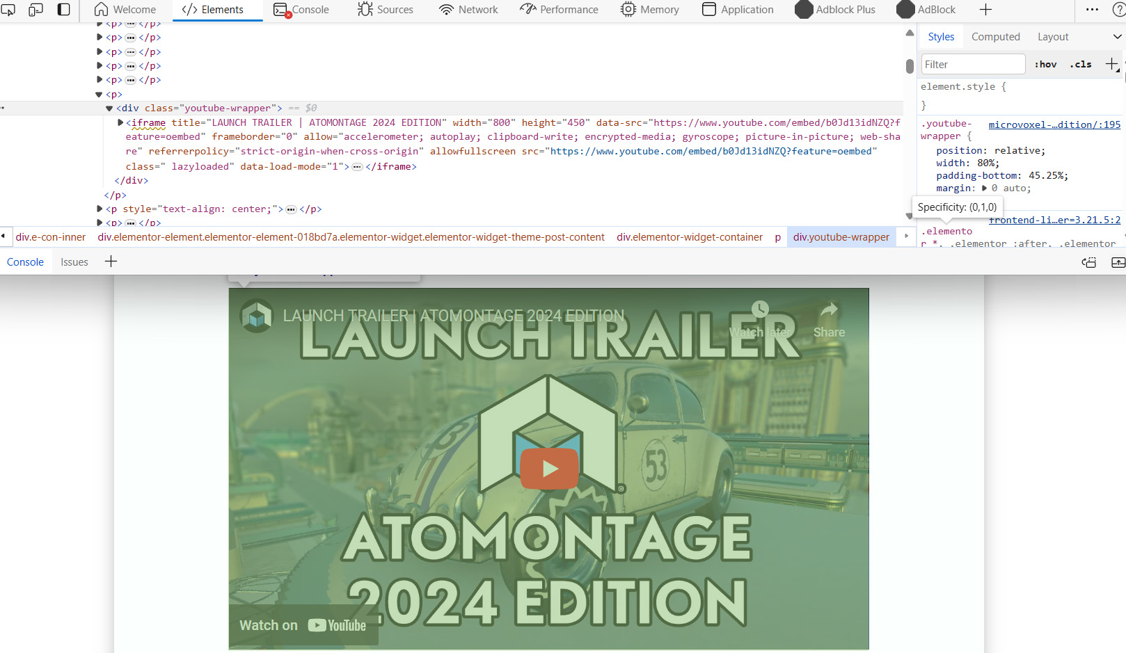
When embedding a YouTube video in a WordPress post, you typically just paste the video link or URL directly. This makes the video display at full width in the post, which might look too large if the post or page has a wider layout. To fix this and make the video size more adaptable, you need to wrap the video iframe in a div tag.
Since pasting the URL directly doesn’t let you modify the iframe code, you’ll have to use JavaScript to wrap the iframe in a div. Here’s how to do it:
- Add the following JavaScript code to the footer of your site:
window.addEventListener('DOMContentLoaded', function() {
  var iframes = document.querySelectorAll('iframe[data-src^="https://www.youtube.com/embed/"]');
  for (var i = 0; i < iframes.length; i++) {
    var iframe = iframes[i];
    var wrapper = document.createElement('div');
    wrapper.classList.add('youtube-wrapper');
    iframe.parentNode.insertBefore(wrapper, iframe);
    wrapper.appendChild(iframe);
  }
}); 
- To add this script, use a theme option, a plugin like Code Snippets, or the Elementor Code option if you're using Elementor. Assign the script to run only on Blog Posts to avoid conflicts.
- Now that the iframe is wrapped in a div with the class "youtube-wrapper," you can style it with CSS to adjust the size and ensure it stays responsive. Add the following CSS to the header:
.youtube-wrapper {
    position: relative;
    width: 80%;
    padding-bottom: 45.25%;
    margin: 0 auto;
}
.youtube-wrapper iframe[data-src^="https://www.youtube.com/embed/"] {
  position: absolute;
  top: 0;
  left: 0;
  width: 100%;
  height: 100%;
}
Adjust the width and padding-bottom values as needed to fit your design. You may also need to add media queries to ensure the video adapts to different screen sizes, making it full-width on smaller screens.
@media screen and (max-width: 768px) {
    .youtube-wrapper {
        width: 100%;
		padding-bottom: 56.25%;
    }
}
Remember, it's important to clearly document your code with descriptive titles so other site admins understand its purpose. Keep this code separate from other scripts for better organization.
In conclusion, wrapping YouTube iframes in a div and using CSS to style them allows you to control the video size and ensure it looks good on all devices. This approach not only enhances the visual appeal of your site but also maintains a professional and user-friendly layout.

